Selected workCase studyMobile communication · Social productivity

Businessfriend.

Businessfriend was building around a sharp idea its founder called "BUSI" — Business Utility first, Social Identity second. The thesis: the typical young professional was juggling five apps a day to get through their work, and one carefully-designed surface could replace all of them. Our job was to design the platform that proved it — a single mobile-first app that pulled messenger, social feed, contacts, cloud storage, video calls, and VoIP into one identity layer for working professionals.

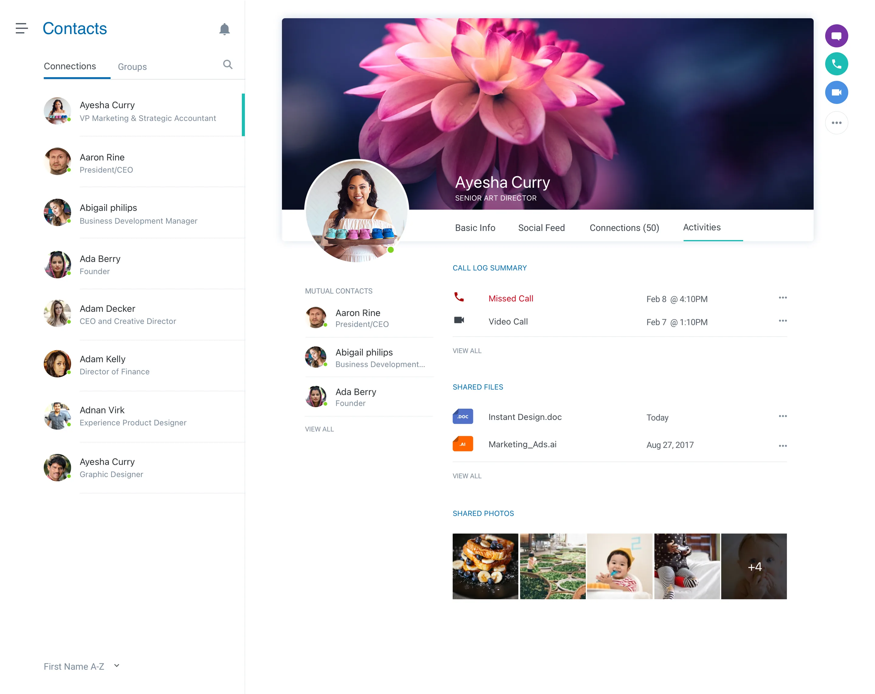
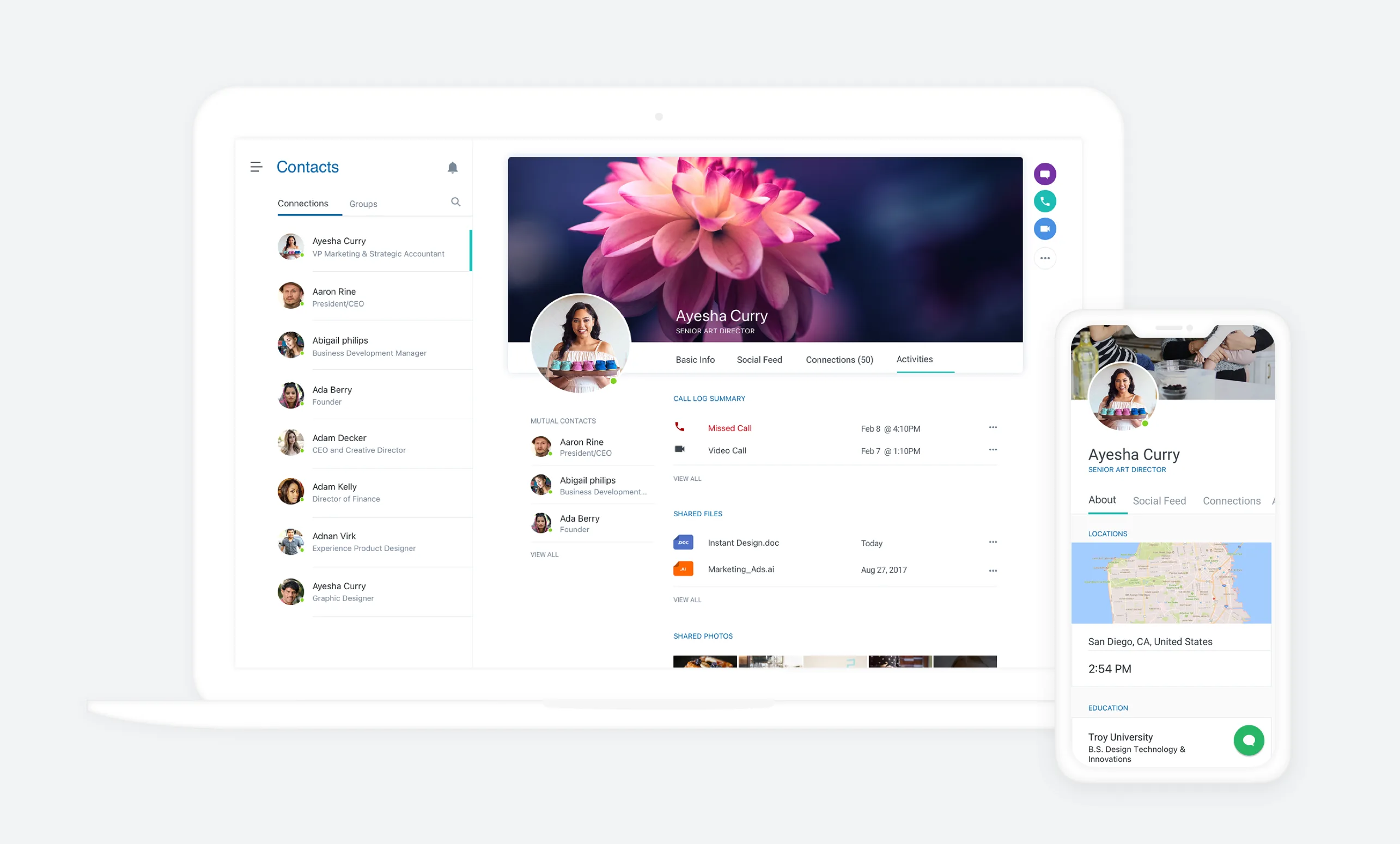
Businessfriend desktop and mobile views — the Contacts surface with Ayesha Curry's profile, basic info, social feed, connections, and activities tabs.

01 · The Contacts surface — one identity across desktop and mobile, Activities and Social Feed folded into the same profile object.

(01)Challenge & scope

Challenge & scope

The category was crowded — every working professional already had LinkedIn for identity, Slack or HipChat for messages, Dropbox for files, Skype for calls, and a Rolodex of contacts scattered across an address book and a CRM. Businessfriend's wager was that none of those products were designed for the way a professional actually moves through a day. The framework — Business Utility first, then Social Identity — meant the app had to feel like a workspace before it felt like a social network.

Our brief was to design every surface the framework touched. The hard part wasn't any single screen; it was teaching the product to behave as one identity across six different feature areas, on three different platforms, without the seams showing.
(02)Design lifecycle

Design lifecycle

Eleven months, five overlapping phases. The work front-loaded discovery — the BUSI framework was a strong organizing idea, but it needed to be pressure-tested against the way professionals actually behaved before we built any screens around it.

  1. i · Frame

    Frame

    Founder interviews. Pressure-tested BUSI against day-in-the-life journals from twenty working professionals.

  2. ii · Architect

    Architect

    Defined the six feature pillars — Messenger, Social, Contacts, Cloud, Notes, Calls — and the identity object that threads them.

  3. iii · Brand

    Brand

    Wordmark, palette, voice. The visual system had to read "professional" without feeling enterprise — utility-first, but warm.

  4. iv · Surface

    Surface

    Mobile-first design across six features × two platforms, with the desktop web following the same primitives at higher density.

  5. v · Launch

    Launch

    App-store assets, marketing site, press kit. Paired with engineering through three release candidates into public launch.

(03)Field testing

Field testing

We tested with the people the framework was built for — sales reps living out of an inbox, project leads bouncing between four tools an hour, founders treating their phone as a one-person company. Three insights kept surfacing across every conversation, and each one rewrote a section of the app.

If I have to switch tabs to find someone's number while I'm messaging them, it's already broken.
— Sales lead · Manufacturing
A profile should feel like the person, not a résumé. Show me what they're working on.
— Founder · Early-stage SaaS
The thing I open at 9am has to be the same thing I'm using at 6pm — not five apps stitched into a calendar.
— Project lead · Agency

The first quote restructured the contact object — calling, messaging, and file-sharing collapsed into a single surface around the person, not the verb. The second redrew the profile to lead with social feed and activities, with the résumé data demoted to a sidebar. The third became the line we wrote on the marketing site.

(04)Design system & implementation

Design system & implementation

One system, six features, two mobile platforms, plus desktop. The trick was building primitives that flexed across density without losing the warmth — buttons, cards, and tabs that worked on a 4-inch screen one-thumb and on a 27-inch monitor at full power-user depth.

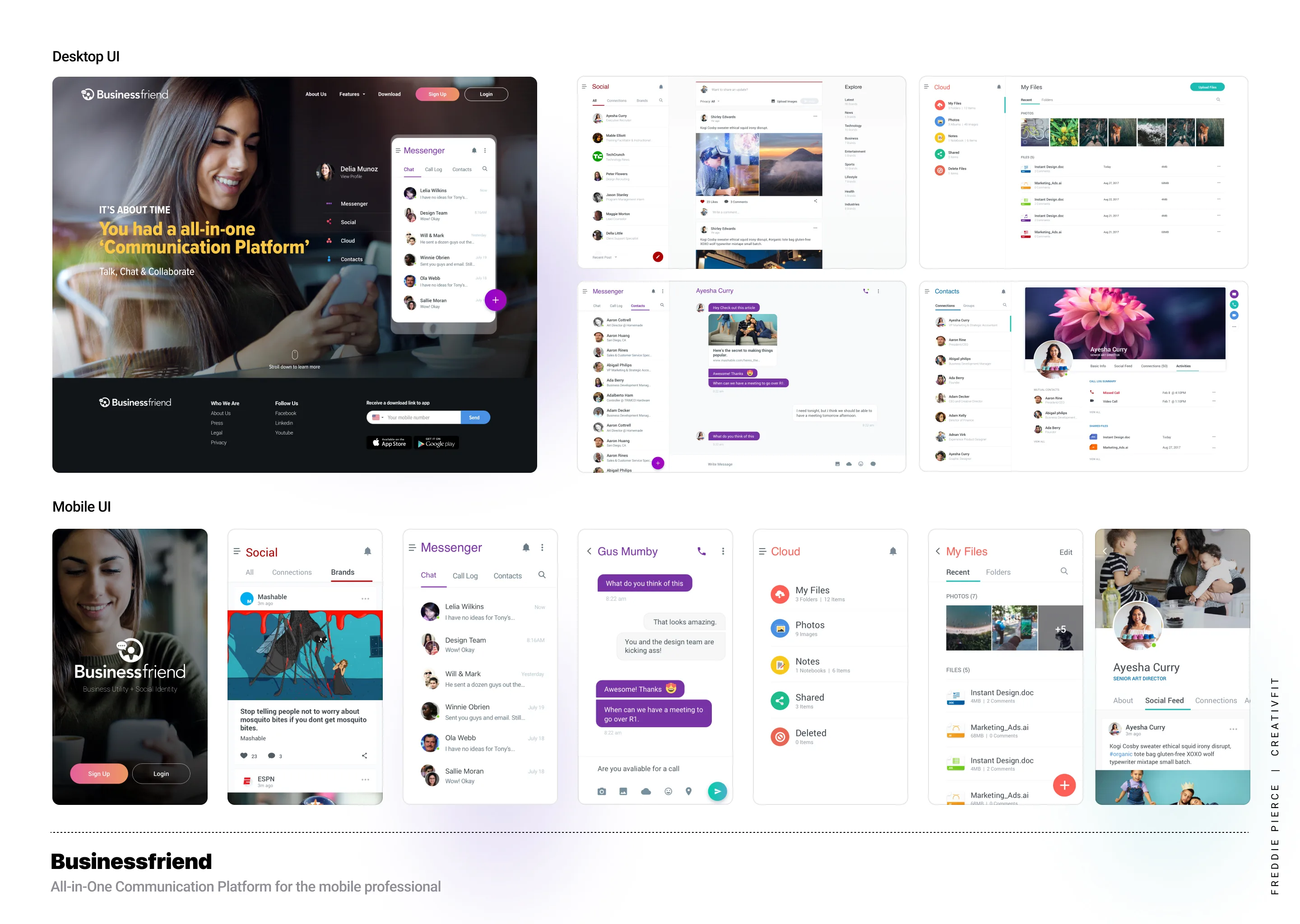
Businessfriend system overview — desktop UI grid above, mobile UI strip below, including Social, Messenger, Notes, Cloud, My Files, and Contacts surfaces.
The system at a glance — six feature pillars × two surfaces, all skinned from the same primitives.

01 / Identity object

One person, every action

Every surface in the app pivots on the identity object. Tap a profile photo anywhere — feed, search, contacts, file share — and the same primitive opens with calling, messaging, files, and activities all attached.

02 / Density flex

Mobile primitives, desktop scale

The same components scale up — list rows compress into table rows, the contact panel grows into a three-column workspace — without re-skinning. One system, two densities, zero forked components.

03 / Utility-first voice

Professional, not enterprise

The visual language reads as a productivity tool first — color used to signal action, not decoration. The "social" layer borrows the warmth of consumer apps without diluting the workspace feel.

(05)The app

The app

Two surfaces did most of the conversion work. The marketing site introduced the framework — Mobile Professionals as both the target audience and the promise. The Contacts workspace was the proof — what BUSI actually looked like when you opened the app.

02 · Marketing site

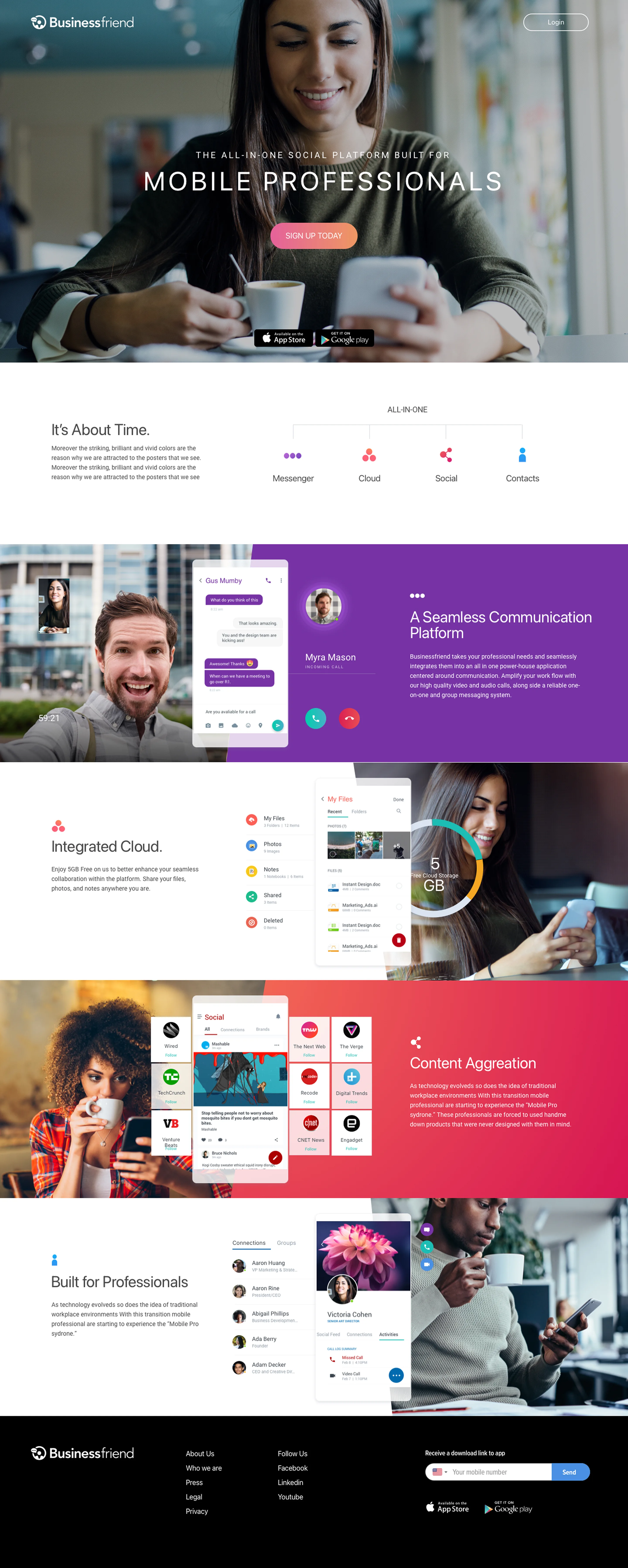
The marketing site led with the people, not the product. A long-scroll page that walked from It's About Time through A Seamless Communication Platform, Integrated Cloud, Content Aggregation, and finished on Built for Professionals — each section grounded in real working scenes, not stock UI shots.

Bright accent colors did the work usually given to illustration: pink for action, purple for the identity layer, teal for cloud, coral for content. The framework taught itself as you scrolled.

Businessfriend marketing site — long-scroll layout from Mobile Professionals hero through Seamless Communication, Integrated Cloud, Content Aggregation, and Built for Professionals.
Marketing site — five sections, one scroll, the framework explained without ever using the word "framework."
Businessfriend Contacts surface — connections list on the left, profile hero with photo and tabs (Basic Info, Social Feed, Connections, Activities), call log summary, shared files, and shared photos.
03 · Contacts workspaceThe product's most-used surface — one identity object per contact, with calling, messaging, social feed, and shared files folded into the same panel. Search, switch, act, never leave the contact.
(06)Outcome

Outcome

  1. 6

    Feature pillars unified under one identity object

  2. 3

    Surfaces shipped at launch — iOS, Android, desktop web

  3. 2 GB

    Free cloud storage included for every account

  4. 1

    App replacing a five-tool stack for the target user

What went well. The framework held up to the product. The contact object did the work of three separate apps, and field testers stopped asking which tab am I in and started asking can I get my whole team on this. The marketing site converted on a single scroll — the long-form layout outperformed the standard three-tile homepage we'd started with in early concepts.

Retrospective. The category was the hardest part. By 2015, Slack was rewriting professional messaging, and a single-app pitch was uphill against vertical-best tools. The product was loved by the professionals it was built for — and the design system survived multiple subsequent product directions, including the manufacturing-sector pivot.

"The BUSI idea was the right idea. What Threewise gave us was the shape it actually wanted to take — six features that finally felt like one app instead of a launcher."

Founder · Businessfriend
(07)Engagement

Engagement

Timeline

~11 months

Tier

Embedded

Services

Brand · UX strategy · IA · Design system · iOS & Android · Marketing

Outcome surface

Marketing, iOS, Android, desktop web, app-store assets

Next case

Motif →Consumer fintech · Product redesign