Selected workCase studyConsumer fintech

Motif.

Motif came to us with a beloved retail product — thematic stock baskets — and a strategic question. They needed to evolve from one-off thematic baskets into a full investment-planning surface, without losing the retail-friendly tone that had earned them their audience.

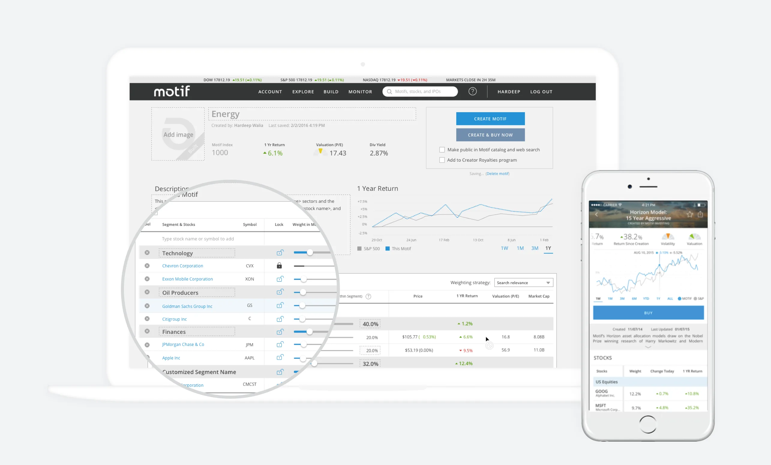
Motif Energy — a thematic basket detail page showing sector allocations and one-year performance.

01 · The Motif detail page — thematic basket as a first-class product object.

(01)Challenge & scope

Challenge & scope

Motifs — curated baskets of stocks built around an idea — had earned Motif a loyal retail audience. But the product had grown laterally: more motifs, more pages, more entry points, and no clear narrative for what a customer was supposed to do next. New investors arrived, picked a motif, and then fell off the path.

The brief widened quickly during discovery. The real opportunity wasn't a redesign of the existing surface — it was building the missing layer above it: a planning experience that turned a one-time purchase into a long-term relationship.
(02)Design lifecycle

Design lifecycle

We ran the work as four overlapping phases. The early phases were heavier — discovery and architecture decisions determine everything downstream — and the later phases tightened into shipping cadence.

  1. i.

    Discovery

    Founder + team interviews, user-flow audit, competitive scan. Wrote the strategy memo before opening Figma.

  2. ii.

    IA & flows

    Object model, surface map, primary user journeys. Mapped the gap between today's product and the planning layer.

  3. iii.

    System & UI

    Design system v2 — type ramp, color, components. Built around the existing brand without breaking continuity.

  4. iv.

    Ship & handoff

    Flow-by-flow design, dev pairing, spec, QA. Final surfaces shipped behind a phased rollout.

(03)Research & analysis

Research & analysis

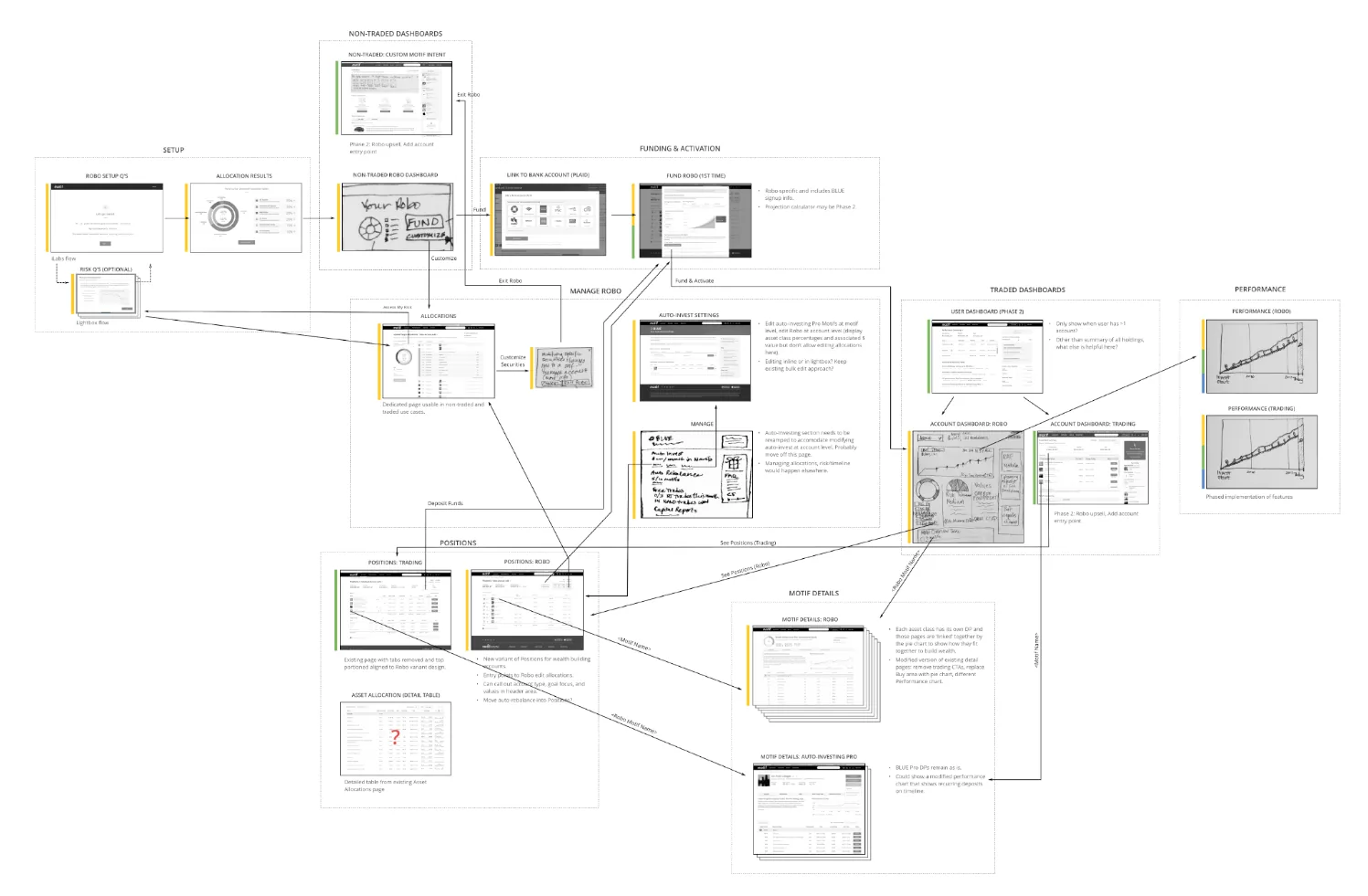
We mapped every screen in the existing product onto a single wall — entry points, dead-ends, repeats, and the unspoken assumptions baked into navigation. The map made the problem visible: customers had no obvious path from I bought a motif to I am building wealth on this platform.

That single artifact reframed the project. The team stopped designing more features and started designing the connective tissue.

A wall-sized user-flow and information-architecture map stitching together every existing screen of the Motif web app.
The IA map — every screen, every connection, every dead end.
(04)Design system & implementation

Design system & implementation

Motif had a workable visual language, but its components were stitched together over years of feature work. We rebuilt the system around the new planning experience — a tighter type ramp, a single canonical chart pattern, and form primitives that scaled from the simplest deposit slider up to the multi-step retirement planner.

The system shipped alongside the product, with documentation the in-house team could pick up and run with.

Ink
Paper
Action
Chart

Type ramp

AaAaAa Aa
(05)The app

The app

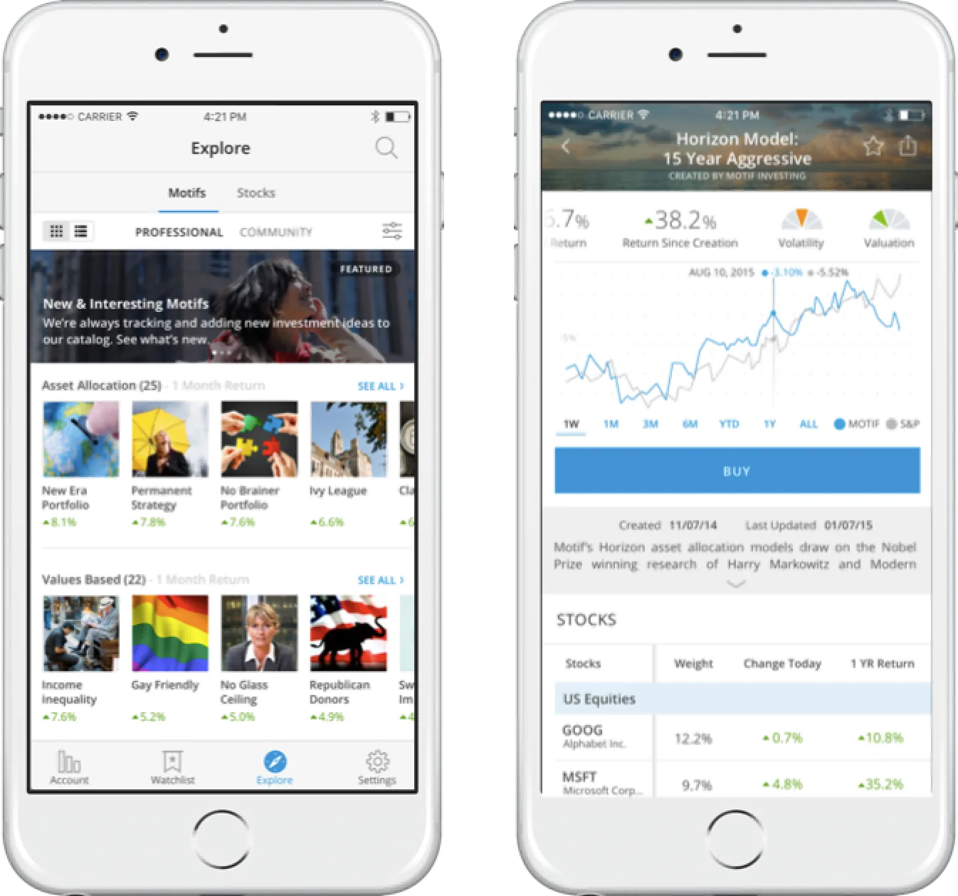
Three surfaces carried the planning layer: the existing motif detail (now positioned as a step in a larger journey), the new investment-plan workspace, and an acquisition-side projection tool that made the value tangible before sign-up.

Investment plan and target allocations screen — projection scenarios, recurring deposits, and asset-allocation targets.
03Investment plan & target allocations — the new planning surface. Projection scenarios, recurring deposits, and asset-allocation targets in one workspace.
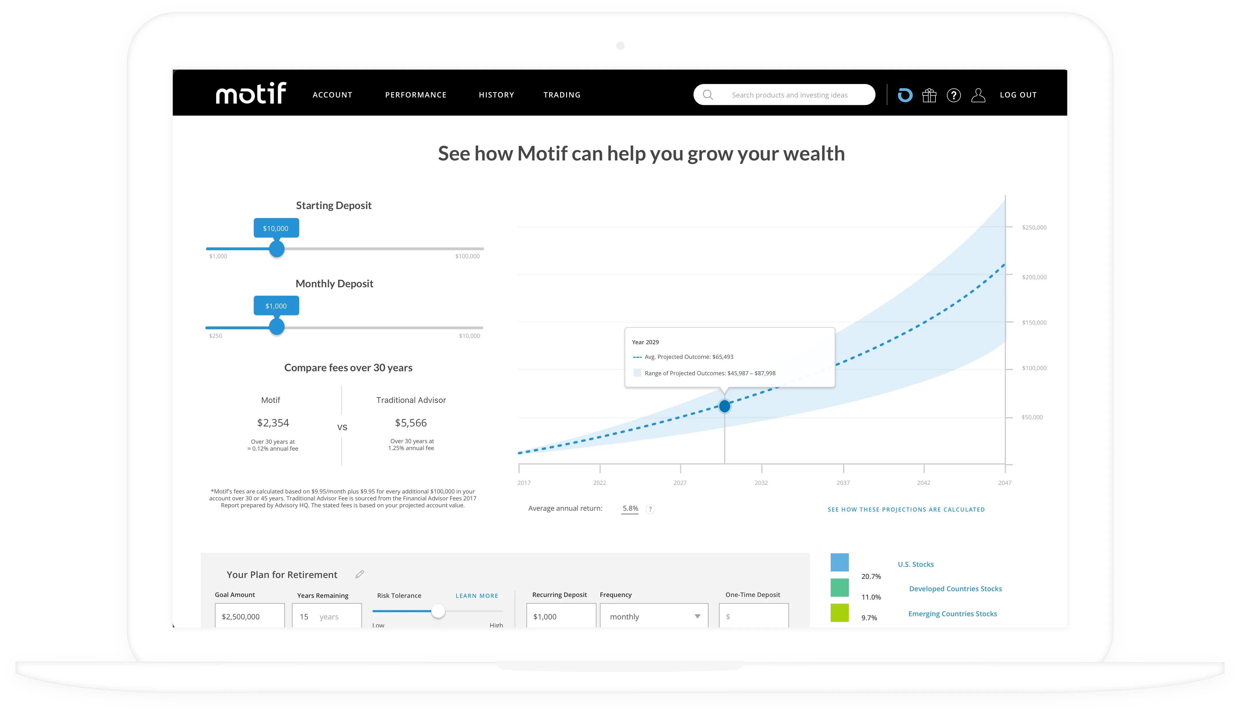
See how Motif can help you grow your wealth — projection tool on the acquisition surface.
04The grow-your-wealth projection tool — placed on the acquisition surface so prospects could see compounding before they had to commit.

Postscript · Video marketing

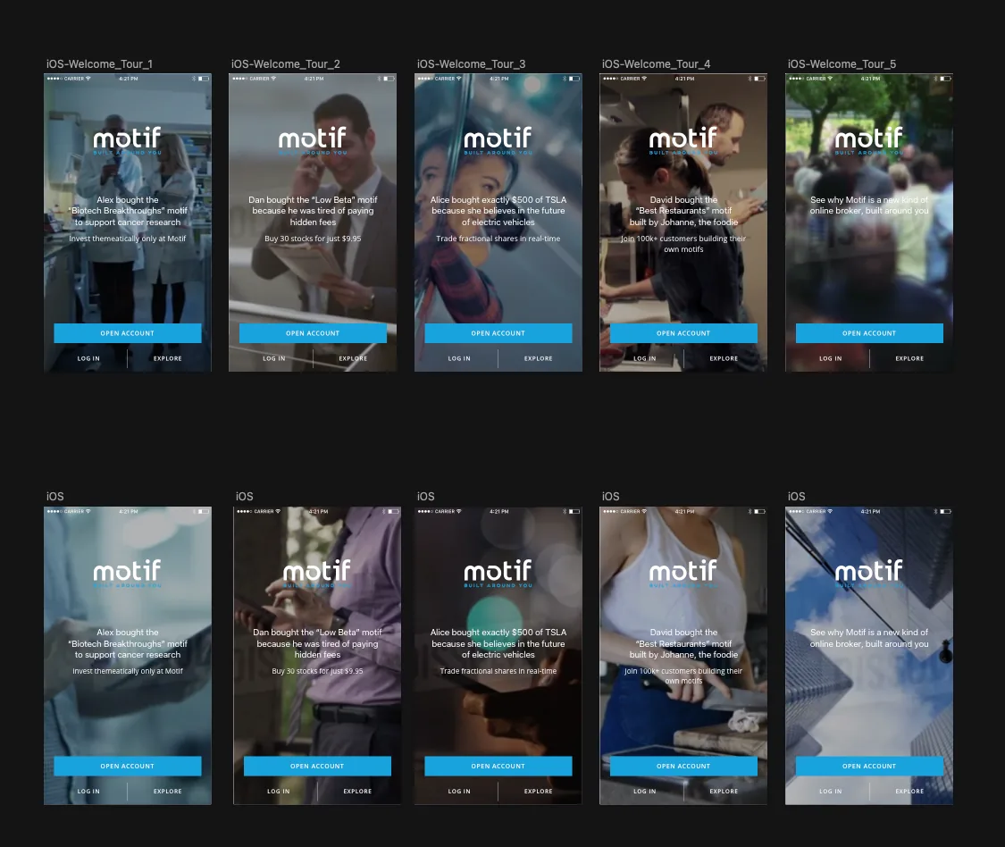
A welcome tour built from real Motif stories.

Marketing leaned on the same insight the planning work did: the platform was most credible when it sounded like a person. We carried that into the iOS welcome tour — five onboarding screens, each anchored on a real Motif customer (Alex, Dan, Alice, David, Johanne) and the actual thesis behind their first investment. Real footage as the backdrop. Real customer copy. The pitch became proof-by-anecdote at the exact moment a new user was deciding whether to open an account.

Ten variants of the Motif iOS welcome tour onboarding screens — five customer-story flows with photographic backgrounds and the recurring 'OPEN ACCOUNT / LOG IN / EXPLORE' CTAs.
PostscriptiOS welcome tour — five customer-story variants, video backgrounds, and a recurring three-button CTA. Built so the tour could swap in fresh stories without a code release.
(06)Outcome

Outcome

  1. +38%

    New investor activation, six-month run-rate

  2. 2.4×

    Recurring-deposit adoption vs prior baseline

  3. −47%

    Time to first investment plan

The bigger outcome wasn't a metric — it was the team. Motif kept building on the system for two years without another senior design hire.

"They came in for a redesign and left us with a way of working. The planning surface is still our highest-converting funnel."

Head of product · Motif
(07)Engagement

Engagement

Timeline

~9 months

Tier

Audit → MVP → Embedded

Services

UX strategy · IA · Design system · Dev-ready handoff

Outcome surface

Web app, acquisition, internal handoff

Next case

Lumity →HR & benefits platform · Embedded