Selected workCase studyHR & benefits platform

Lumity.

Making sense of the cost of health benefits at scale is a difficult problem. Most heads of HR rely on third parties to broker their plans year-to-year — with no real insight into what's happening behind the scenes when rates get negotiated. Lumity set out to fix that with Benefit Offers Marketplace: a 100% transparent view of clients, carriers, and brokers in one place, replacing the deck presentations and legacy tools the industry had been stuck on.

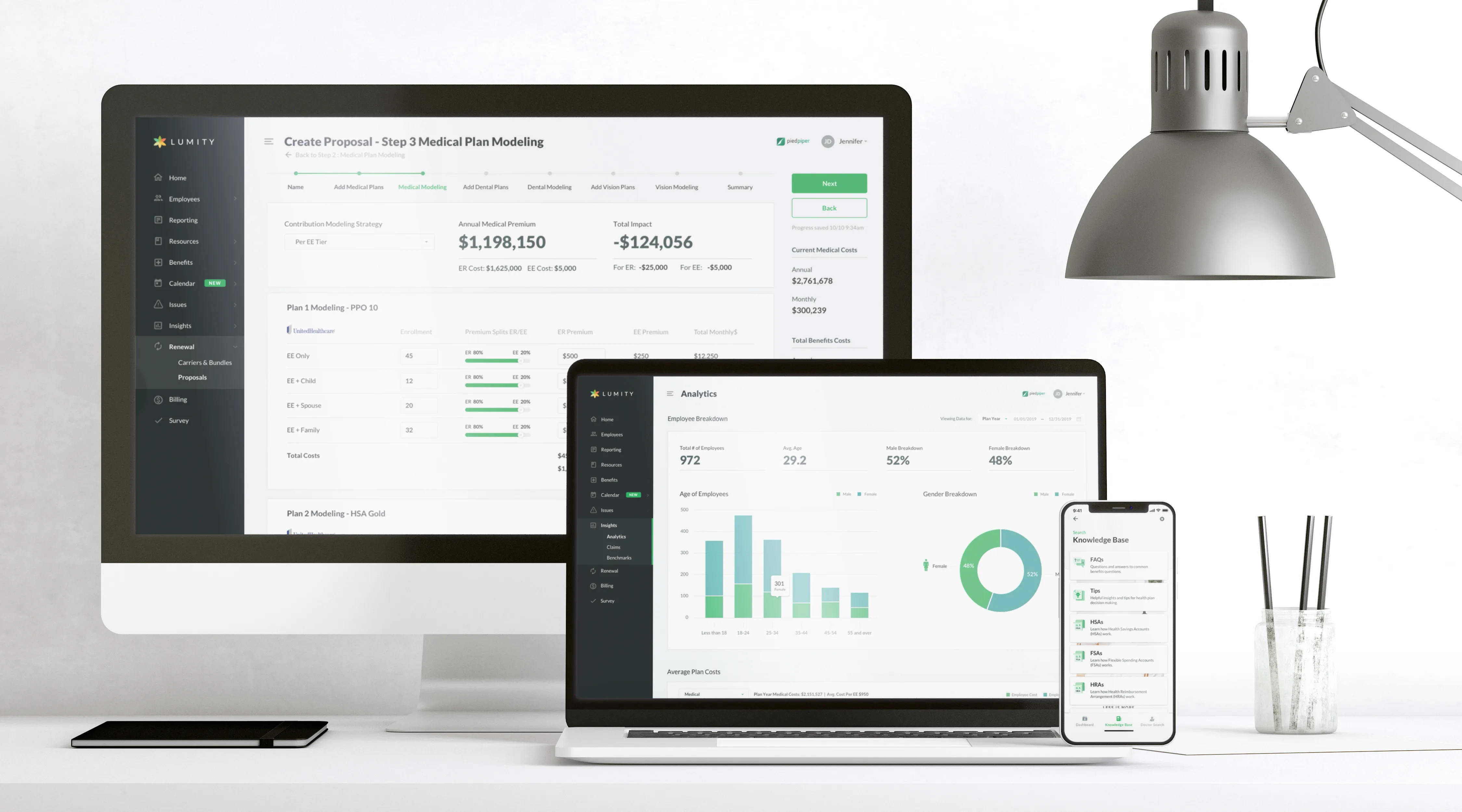
Lumity Benefit Offers Marketplace shown across desktop, laptop, and mobile devices.

01 · Benefit Offers Marketplace — one transparent surface across every device the team uses.

(01)Challenge & scope

Challenge & scope

Heads of HR were buying multi-million-dollar benefits plans with almost no visibility into the trade-offs. Brokers presented offers in static decks, year-end renewals turned into spreadsheets-by-email, and nobody — not the client, not the carrier, not the broker — had a single source of truth for what was actually on the table.

Lumity's answer was the Benefit Offers Marketplace — a product that put all three sides in one view and made the modeling transparent. Our job was to design the surface that made that promise true: clean enough for an HR director to navigate without training, deep enough for a broker to defend a proposal in front of a CFO.
(02)Design lifecycle

Design lifecycle

We ran the work as six overlapping phases. The early ones — strategy, research, mapping — were where the product actually got decided. The later ones tightened into shipping cadence.

  1. i. Strategy

    Strategy

    Consult with account managers to alleviate the problem of clunky modeling decks and define measurable goals for Lumity and its new HR end-users.

  2. ii. Research

    Research

    Analyze Lumity's position against competitor offerings, identify user perceptions, and develop initial user stories.

  3. iii. Experience mapping

    Experience mapping

    Develop broker, HR-lead, and employee personas; map IA and primary user flows with PM.

  4. iv. User testing

    User testing

    Usability testing with both internal and external users across all three personas before fidelity rose.

  5. v. Design

    Design

    Prototype with wireframes, then move to fidelity UI mockups once flows had cleared testing.

  6. vi. Implementation

    Implementation

    Work with the Lumity engineering teams to implement, test, and troubleshoot interactions and UI in a phased release format. Partner with marketing to surface new features on the website.

(03)Iterate, test, repeat

Iterate, test, repeat

Storyboarding and planning user flows early in the process let us hold the entire customer journey in one frame — both the macro shape and the details inside each interaction.

We met with industry experts in the health-broker and carrier fields to research how a product like this could change their engagement with clients, and where it could trim friction out of the renewal cycle.

Once we were confident in the key interactions of the MVP, we actively prototyped and user-tested internally and with a handful of external partners — broker shops and HR leads willing to put time into the early surface.

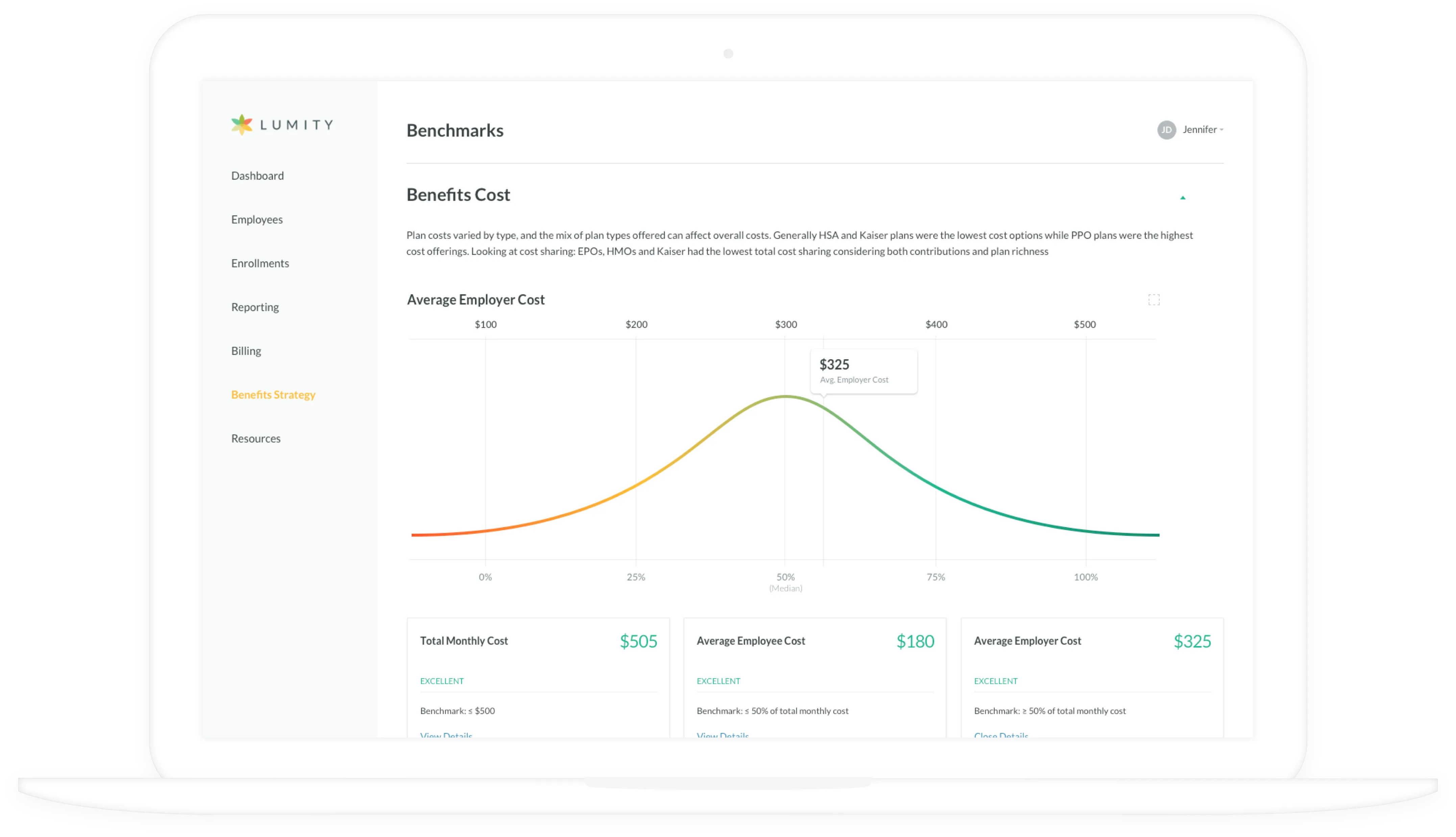
Lumity Benchmarks page showing the Benefits Cost curve and KPI tiles below.
The Benchmarks surface — usability-tested with broker partners before fidelity rose.
(04)Design system & implementation

Design system & implementation

We worked with a distributed development team — a mix of in-house and offshore engineers — to ship the Benefit Offers portal, and we had to make sure information stayed consistent across every channel. We passed segments of the design to the dev team in waves, took feedback early in implementation, and used InVision for detailed specs and asset handoff.

We interacted with engineers on a daily basis, plus a weekly stand-up to keep the cadence tight:

  • Discuss progress and milestones for the bi-monthly release cadence
  • Make sure the design landed per system spec, not just "close enough"
  • QA and test the interactions, including the edge cases the dev team flagged
  • Answer questions so everyone stayed on the same page across timezones
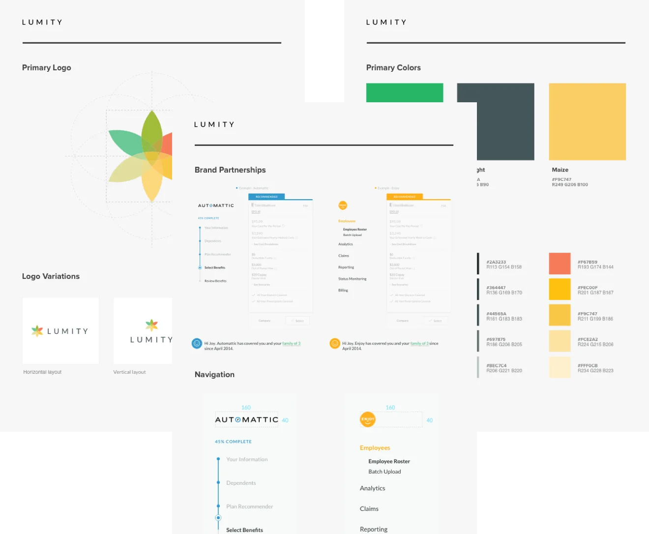
Lumity brand style guide showing primary logo, color palette, partner integrations, and navigation patterns.
Design system v2 — tokens, components, partner-brand variants.
(05)The app

The app

Three surfaces carried the marketplace promise: a broker-facing portal for building and modeling offers, an HR analytics dashboard for understanding the workforce that would be enrolled, and a mobile app that put the resulting benefits in the employee's hand.

Lumity Analytics page — employee breakdown with age, gender, and average plan-cost charts.
02Analytics dashboard — employee breakdown, average plan costs, and the underlying data HR leads use to evaluate offers.
Lumity Benchmarks page with the Benefits Cost bell curve and KPI tiles.
03Benchmarks — distribution of total monthly cost across the carrier landscape, with the client's position called out against the median.
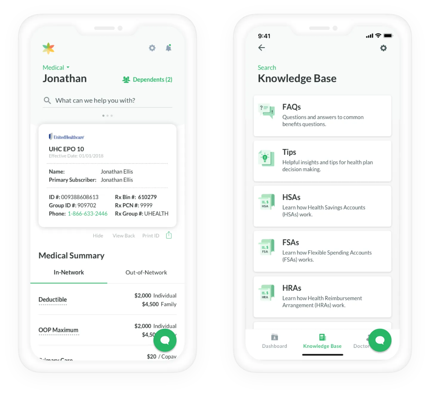
Lumity employee mobile app — medical insurance card view and knowledge base.
04Employee mobile app — coverage card, in-network details, and a knowledge base built so employees never had to call HR to find their own deductible.
(06)Outcomes

Outcomes

  1. >18%

    Annual renewal rate against a >16% goal

  2. 3

    Personas served by one consistent system

  3. −1

    Deck presentations the account team had to maintain by hand

What went well. We launched the product to a group of high-touch customers to gather feedback through surveys and interviews. The cohort came back with overwhelmingly positive responses — renewals landed above the 18% bar against a 16% target.

A flexible design process plus tight dev teamwork meant we could ship a tool that delivered transparency to both ends of the partnership spectrum (carriers + HR leads) while also relieving the account management team of the deck-maintenance burden that had been quietly eating their week.

Retrospective. The healthcare-broker space is a complicated arena with real pitfalls — federal regulation, slow-moving incumbents, and a long tail of carriers who weren't ready to expose pricing data via API. That pushed the wider launch out further than we'd hoped. The plan is to have the surface available to the majority of Lumity's book by end of year.

"The marketplace stopped being a sales prop and started being the workspace. That was the unlock."

Account director · Lumity
(07)Engagement

Engagement

Timeline

~14 months

Tier

Embedded

Services

UX strategy · Research · IA · Design system · Dev partnership

Outcome surface

Broker portal, HR dashboard, mobile app

Next case

Productfy →Embedded finance · BaaS